

Grafana is a data visualization tool for monitoring applications and infrastructure, powering alarms, identifying errors, and crunching statistics. We use it primarily for their dashboards to monitor the health of our customer’s deployments, but we quickly ran into a very familiar problem:
Why does this cost so much?
Having an at-a-glance view of your entire system health is incredibly useful for maintaining a reliable and stable system, but even minimal changes can rapidly and unexpectedly grow your bill. While many teams can bypass this by self-hosting Grafana, there’s something to be said for the ease of use and maintenance that Grafana Cloud offers.
For basic Grafana setups, the core cost drivers are metrics, logs, and traces. If you’re using Grafana solely for visualizations, it’s likely that the primary cost generator is metrics and the fees associated with ingesting them. We’ll focus on how to identify expensive metric sources and how to reduce metric costs while maintaining functionality.
How does Grafana Pricing for metrics work?
To understand how to reduce your bill, it helps to understand what you’re being charged for. Grafana pricing for metrics focuses on two concepts:
- Active series: time series that receive new data points. A series becomes inactive when data isn’t received for 30 minutes. Grafana charges $8 per 1000 active metric series.
- Data points per minute (DPM): the number of times a metric reports out data to Grafana in a given minute
Putting that all together, we get a calculation like this:
Number of active series × DPM × ($8 / 1000 active series)
With 30000 active metrics reported via Prometheus, your billable metrics would be:
30000 × 4 × ($8 / 1000) = $960
Grafana charges based on the 95th percentile of the total number of active series. This means that the top 5% of usage isn’t billed, allowing some wiggle room for unexpected or temporary spikes in metrics. Spikes can be caused by a misconfigured metric or collector, but could also be the result of legitimate spikes in system activity, outages or DDoS attacks.
Identifying costly and unused metrics
The Cost Management dashboard provided by Grafana is the first stop when trying to identify what is driving costs up. To get a better understanding of which metrics sources are being charged, open Grafana and head over to Cost Management in the sidebar. Select Metrics and open the Billing dashboard - Total billable metrics series.
Here you’ll see the billable series for metrics, showing point-in-time data about the number of active series. You’re billed as the month goes on, not at the end, so eliminating metrics will affect the total cost of the current month, but the earlier in the month the bigger the impact. You’ll notice that the billable series will decrease as you eliminate metrics.
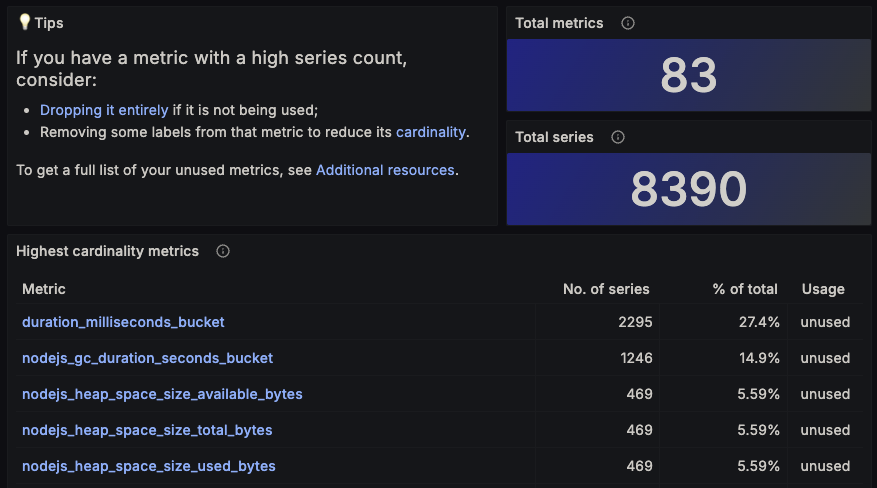
The next stop on reviewing costs is the Cardinality management dashboard, also found on the Cost Management > Metrics page. This page displays great information on what metrics you’re sending, how often they’re used in visualizations and other Grafana services, and what percentage of the total metrics they account for. For example, duration_milliseconds_bucket makes up over a fourth of all metrics being sent to Grafana. This default metric provided by the OpenTelemetry Collector can be useful in visualizations, but is currently unused by us and would save us 27% of our bill.
Ultimately, there’s no single rule to follow when managing your metrics - you need to have enough context to understand if your metrics are used and if they’re useful. Spending time identifying the useful metrics and labels, while eliminating those not in use, is a solid first step.
OTel Gotchas - Removing span metrics from the OpenTelemetry Collectors
For those using the OpenTelemetry Collector, a common pitfall is having the Span Metrics Connector enabled. While some teams may leverage this tool to generate metrics based on spans, it can result in a huge amount of metrics, many of which aren’t used. Disabling this connector can be accomplished by removing spanmetrics for your OpenTelemetry config.yml. Alternatively, the outputted metrics can be reduced by configuring resource_metrics_key_attributes to filter out which spans will result in metrics. This step took minutes for us, but immediately reduced our metric count significantly. While we may look in the future to build visualizations around this data, it wasn’t necessary yet.
Reducing data points per minute
Reducing your data points per minute (DPM) is an easy way to get immediate results without a significant reduction in functionality of your visualizations. A higher DPM means your visualizations will update more frequently and provide faster feedback, while lower DPMs are better for long-term visualizations driven on metrics that don’t change as often.
If you’re using Prometheus to obtain metrics, the default scrape interval is 15 seconds, meaning a given metric will be updated 4 times per minute and resulting in a DPM of 4 for a single metric series. If you use GrafanaCloud integrations, such as the Grafana Agent, the default scrape time will be only once per minute, resulting in a DPM of 1 for a single metric series. This can be controlled by the scrape_interval setting in both Prometheus and in the Grafana agent. You should weigh if a reduction in update frequency is worth the possibly substantial savings.
Adopting Adaptive Metrics
Reducing the overall number of metrics is easier said than done for some, especially when dealing with a large array of applications across multiple teams. Grafana Adaptive Metrics takes some of the hurt out of figuring out where the metrics are coming from. Let’s look at three example metrics:
{
“name”: “error_count”,
"value": 0,
"labels": {
"instance": "192.168.1.42",
"customer": "bob"
}
}

{
“name”: “error_count”,
"value": 1,
"labels": {
"instance": "192.168.1.97",
"customer": "bob"
}
}

{
“name”: “error_count”,
"value": 0,
"labels": {
"instance": "192.168.1.132",
"customer": "bob"
}
}
If we have a visualization that displays total failures by customer, we’d want to be able to tie a given error_count metric to the customer associated with the metric, making the customer label important. The instance label isn’t necessary in this case, allowing Grafana Adaptive Metrics to shine. This tool automatically identifies and recommends rules for dropping or aggregating superfluous or repetitive labels. You can review Adaptive Metrics recommendations by navigating to Cost Management > Metrics > Adaptive Metrics in your Grafana dashboard.
Reaching a healthy medium
Maintaining an effective dashboard can greatly benefit your team, but finding a middle ground between cost and value is important. The best approach we found was to begin by importing all relevant metrics, reviewing what is available, and building out effective dashboards. We continued to iterate by identifying critical areas to monitor, adding additional observability to our applications, and adding those metrics to Grafana. After we were comfortable with our level of visibility and monitoring, using the steps above to clear out unused metrics or low value metrics managed to save us more than 70%. There’s still ongoing maintenance and cleaning as we continue to build out our observability, but an hour or two of spring cleaning has helped us manage our Grafana costs.
That's all for today's blog post - if you're interested in taking control of your telemetry, check out Datable.io and sign up for a demo today.